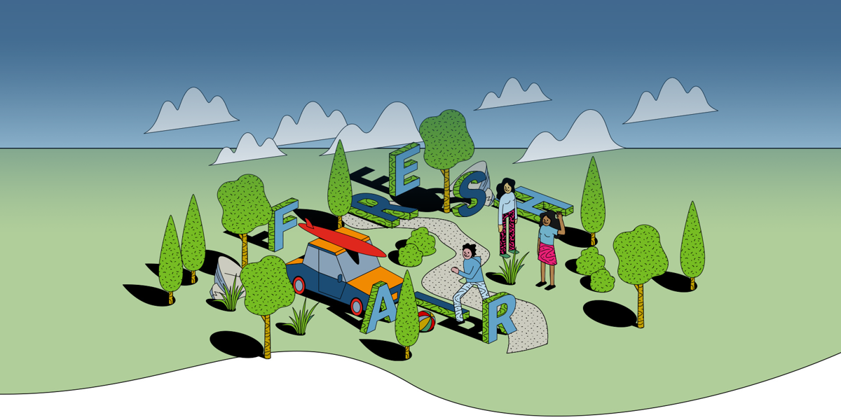
The microsite needed to highlight the benefits of planning pulled from a recent public perception survey as well as allow the capacity for engaging case studies about the people in the industry. As part of the project, we delivered;
- A new sub-brand including name, logo, visual style, and typography.
- Engaging and focussed UX
- Mobile-friendly animated graphics
- A component driven microsite developed within RTPI’s existing Umbraco CMS

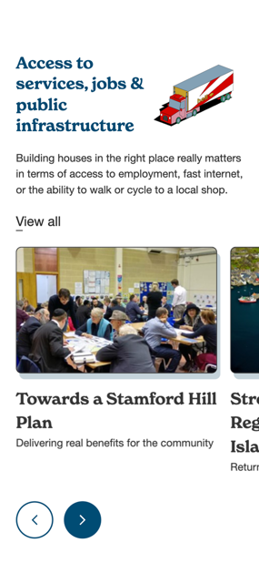
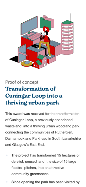
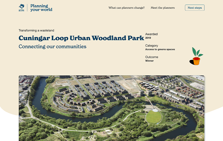
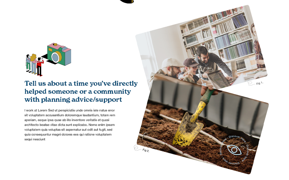
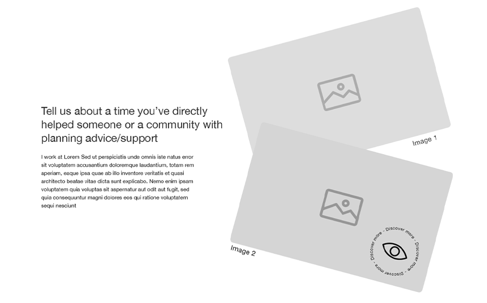
RTPI had recently completed a public survey with 2000 participants on their perceptions of planning. Affordable housing was the most popular response, but RTPI realised there was a lack of knowledge about the other benefits of planning, especially amongst younger people.
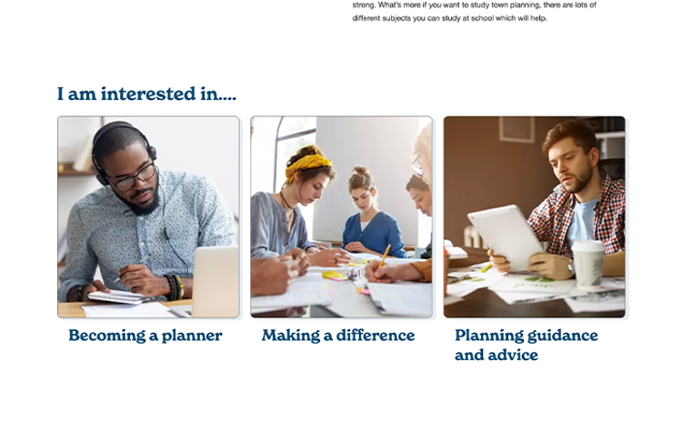
Our UX & Creative teams started reviewing the survey results and pulled out the key benefits, particularly those that participants were unaware of, to drive the design on the website. RTPI were keen to make sure the website was interactive to dispel the idea planning is ‘boring’, so Mentor produced wireframes and full page designs based on a fun and modern design style which had the capacity for animation and micro-UX nudges.
To achieve this design, Mentor built the microsite within RTPI’s existing Umbraco CMS using components to allow RTPI to create a content rich site combining video, photography and illustration that could be developed year on year.
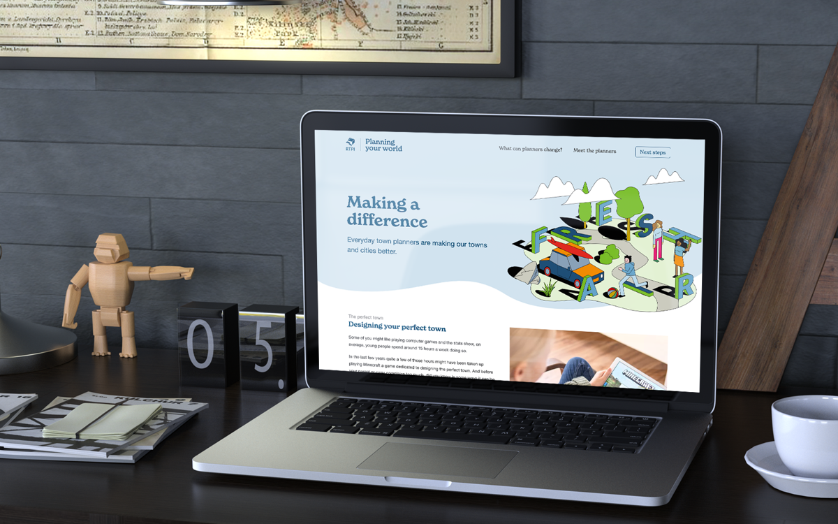
“We are delighted at the way in which Mentor translated our project brief into an exciting and dynamic new microsite.”
Andrew Pilkington - Web Manager at RTPI

“We’ve had fantastic engagement and feedback on the site since launch and receive regular requests from planners to be featured on it. The site is helping to enable us to transform the perception of what planners do and the significant contribution they make to society.”
Andrew Pilkington - Web Manager at RTPIEveryday planners are making our towns and cities better
