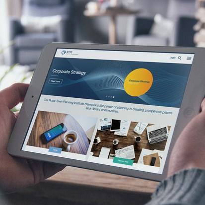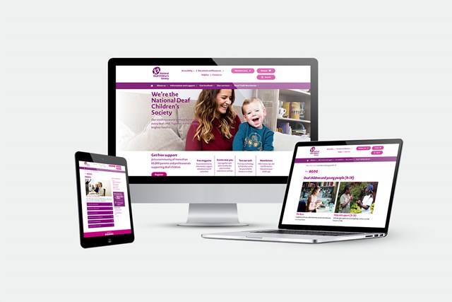
We developed not only the website and CMS but also highly complex membership registration, events payments systems, and CRM integrations, and we are delighted with the results from this extensive and rewarding project. With a large amount of fantastic content to communicate to various users, Mentor Digital embraced the challenge of creating one site which uses clear messaging and tailored user paths to guide professionals, children and parents to the relevant resources and information
- Discovery - user personas & research
- Project planning & stakeholder engagement workshops
- HTML prototypes & wireframes
- UX testing & eye tracking
- Graphic design
- Website development
- Blackbaud CRM integration

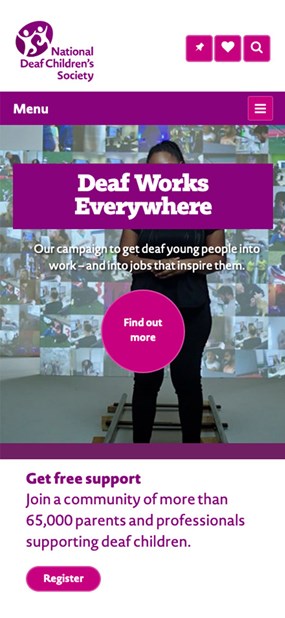

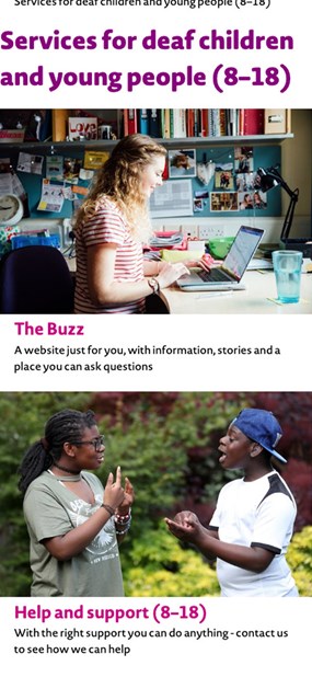

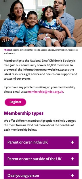
Our discovery phase on this project began with multiple workshops and stakeholder engagement sessions, along with audience interviews and research, in order for our team to establish the key user personas for the NDCS website. These groups included deaf children, young people and their parents, as well as mainstream professionals, such as teachers.
To consider how and why these individuals interacted with the site, Mentor Digital’s UX team gave a cross section of users exercises which asked them to download materials or provide a donation. This process helped us to establish any possible existing barriers and explore ways to optimise the journey for each user. We used our eye tracking suite to test our desktop UX prototypes and our mobile testing camera for testing mobile users.
The results led us to give the site a new vibrant look and feel, improved mobile responsiveness and a clearer, more straightforward navigation. We also designed an improved blog and a member’s area where users can access information such as newsletters, articles and other benefits. As NDCS are a charity, we ensured that certain ‘calls to action’ were made more prominent, such as the donate button.
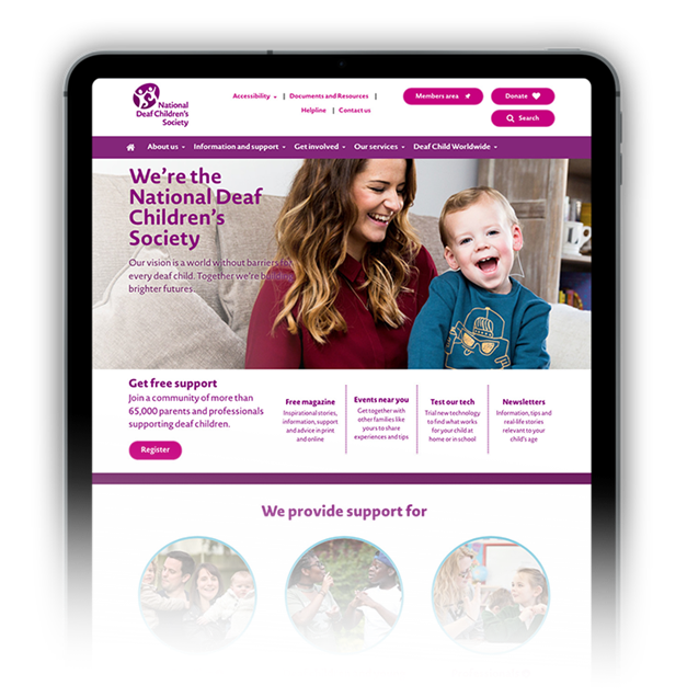
Our vision is a world without barriers for every deaf child


